Success Connect

A Community Experience to Connect Incoming Students to Success

 
sc-banner.jpg


Google-UX Intern 2021

Design Challenge-Offer Received

Design an experience that allows new students to ask questions about school life, and experienced students to share answers and advice.

Software

Miro, Procreate, Figma

Duration

7 days (30 hours)

My Roles

UX Research & Design

 
sc-process-01.jpg


01 Overview - What is Success Connect?

Background & Chosen Prompt

This project is a part of the Google 2021 UX intern design exercise. Out of the two prompts, I choose prompt 2.

Prompt 2

“Your school is gearing up to welcome a new incoming class and would like to help them adjust to campus life. Design an experience that allows new students to ask questions about the school life, and experienced students to share answers and advice. Consider the needs of a student who has questions, and the experience for a student who would like to give advice.”

One of my on-campus jobs is to work with underrepresented students on campus and ensure their academic, personal, and social success at Michigan. Therefore, I feel deeply about this prompt.

Target Users

  • Incoming students

  • Transfer students

  • Experienced students

What they are looking for

An experience to ask questions about school life and share answers and advice in a seamless way, which includes:

  • 1-on-1 personalized conversation

  • Academic and career resources like tutoring, research-paper writing support, and collaborative study tables

  • Community-based workshops and social interaction


“How might we provide a holistic experience to connect incoming students with experienced students to achieve academic, personal, and social success at the University of Michigan?


01 Make a better match

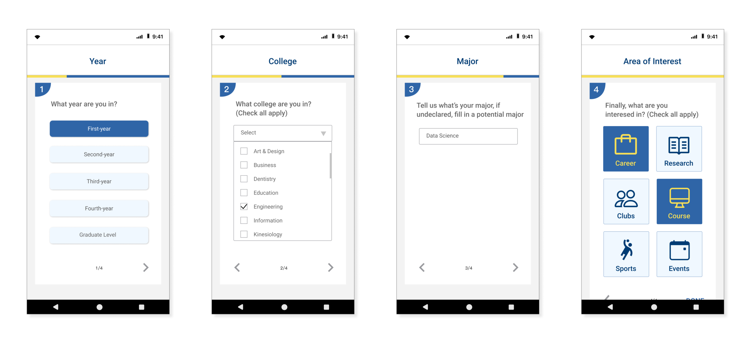
This experience provides a good match for incoming students and experienced students using a set of concise questionnaires. The questions are designed around the students’ academic focus and interest areas about campus life. This way, students can have their questions answered more efficiently, and experienced students can provide advice based on their expertise.

 
search2.gif
post.gif
 

02 Incoming Student: Ask a question

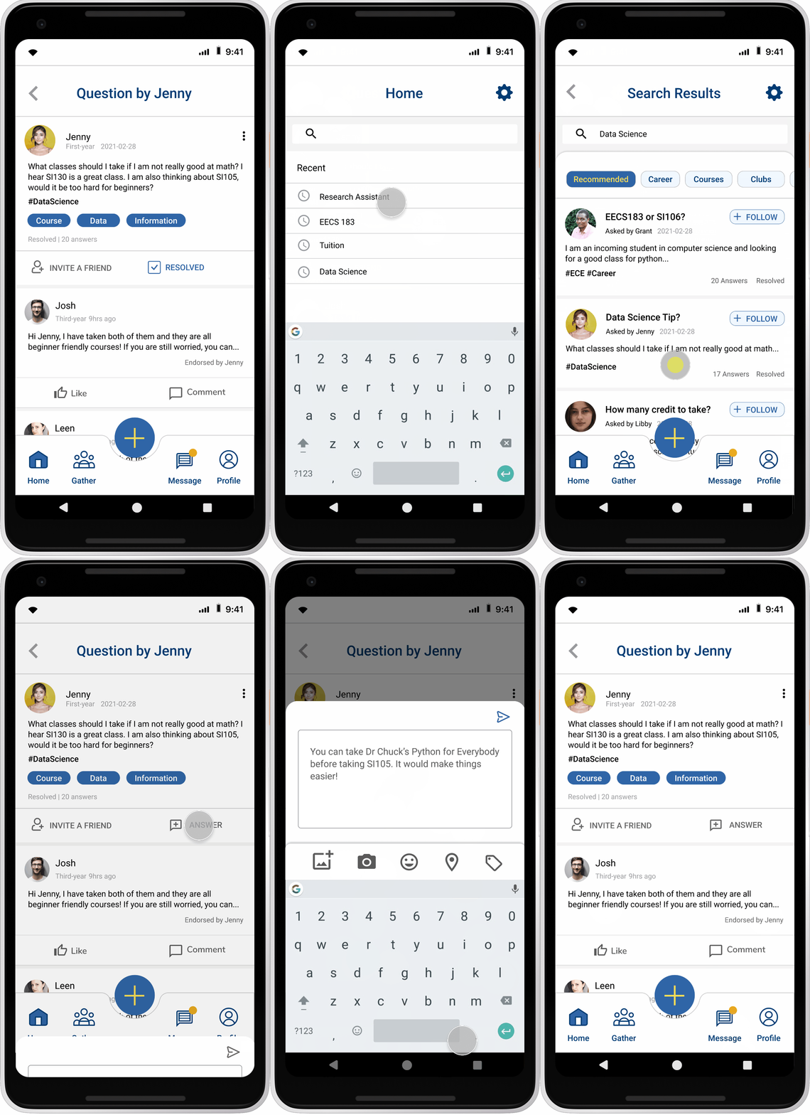
Incoming students get a list of questions suggested by the app based on their questionnaire answers. The student can follow question threads related to their interest. They can also post a question and use hashtags to get more related answers. There are also categories that help to make the questions seen by experienced students.


03 Experienced Student: Answer a question

Experienced students can answer a question easily by searching keywords or simply click on the answer button. There is also a status indication that highlights unresolved and unanswered questions. If the question is out of the user’s expertise, they can use the invite button to refer another friend to answer this question.

 
answer.gif
message.gif
 

04 One on one Communication

The message function allows one on one communication for students to connect and establishing mentorship. I also want to integrate the Google Meet feature for synchronous interaction between students.


02 Understand - How to Better Support the Students?

User Interviews

Relating to my personal experience and secondary research working with incoming and transfer classes, I created an interview protocol asking user’s challenges and needs when first coming to campus. To consider potential users broadly, I included transfer students in the target users, because they will have similar needs as the incoming class. I conducted 3 user interviews. The demographics included a first-year student, a third-year transferred student, and a graduate student who works as a student consultant.

 
*Avatars created by Bonnie Jiang. Avatars do not represented the look of the actual participants.

*Avatars created by Bonnie Jiang. Avatars do not represented the look of the actual participants.


Data Analysis

Based on the time constraints, I did not administer a survey and only gathered qualitative data. I use affinity mapping to synthesis the quotes and comments from the interviewees. It helped me identify common pain points from both incoming and experienced students.

Key Findings

  1. Students are looking for career/professional support rather than social/logistical questions, but it is hard to find a good match.

  2. Although users have mixed feelings towards online communication, they identified that community-based interaction is beneficial.

  3. Experiences students rely on strategies like holding office hour and referrals to help

 
affinity.jpg
 

💡Identify Key Functions Our Solution Supports

I identified 4 key functions our solution needs to address:

  • Matching incoming students with experienced students in specific categories

  • Allowing one on one message/audio/visual communication

  • Sharing and connecting with groups

  • Supporting referrals and network development


Competitive Analysis

01. 🔍Identify Competitors’ Products with the Function

Based on the challenges learned from interviews, I identified competitors who are currently addressing the needs and divided the competitors into the following categories:

 
Competitor Analysis.jpg
 
Competitors Types of Competitors Pros Cons
WeChat Analogous Competitor
  • Free of charge
  • People can get information in various ways easily
  • Requires existing social network
  • Not suitable for professional settings
Guidebook Parallel Competitor
  • Tailored towards college students
  • Various categories and services
  • Limited to logistical questions
  • No group interactions
Facebook Partial Competitor
  • Customizable categories
  • Group interactions
  • No immediate one-on-one opportunities
  • Less focused on professional development
Graduway Direct Competitor
  • Professional for career development
  • Hard to expand the network
  • Limited categories

02. 💡Reflection/Lessons Learned

In conducting competitor analysis, I developed a better understanding of the key functions and how they are realized through existing solutions. I learned that users use a combination of apps to fulfill their needs. Incoming students use social media platforms to do outreach and experienced students rely on referrals and connections to talk to new students.

Currently, there is no holistic experience that integrates connecting students, group interactions, and instant communication.

Therefore, the integration will be my main focus.


Persona

Based on the interviewees, I created 2 personas. I combined the transferred student and incoming student into one persona because they have similar needs. Although I need to be more careful about the nuances. After I gain enough understanding of these personas’ needs and wants, I set Jenny, the incoming student as the primary persona. I selected this persona because she shared the most challenges with other groups.

Jenny.png
Ted.png
 

Storyboard

I did rapid storyboarding to explore a scenario that includes both Jenny, the incoming student, and Ted, the experienced student. I painted a context where they are both troubled by the unperfect match. This scenario helps me to understand users’ thought processes and needs for one of the key functions—finding a perfect match/ask questions in a specific area.

storyboard.jpg
 

Design Decisions & Tradeoffs

I decided to design a mobile app experience to connect incoming and experienced students focusing on the following features:

⭐Provide a more suitable match

  • Onboarding questionnaire to match mentors and students.

  • The home page features different categories for the forum posts.

  • Making posts with tags to get more accurate answers

⭐One on one communication + Expand Network

  • Messages + Calendar integration for Google Meets

  • Allow experienced students to refer others to the incoming students

Stretched Goal: Community-based workshop

  • Discussions inspired by Clubhouse: multiple speakers

❎ Tradeoffs I made

I decided to not focus on the logistical questions that the incoming class may have, such as dorm rooms, meal plans, and building locations. Although these features can help students to quickly adapt to campus life, I decided to not focus on them because there are existing solutions that users can adapt to. My interview findings also identify that these logistical questions are not the user’s primary concerns, while professional development can help the incoming students in a long run.

User Flows

After deciding on the device and mapping out the feature, I first sketch out the user flow to gain a holistic view of the whole flow. Then I created a more detailed wireframe for interactions and screens.

 
user flow sketch.jpg


user flow.png


03 Diverge - What Features should We have?

Wireframes

First Iteration

Based on the featured functions, I came up with the wireframes.

 
sketch2.jpg
 

First User Testing

I did a quick concept test with two proxy users. I conducted my first user testing with the wireframes. This step is to make sure users’ cognitive process matched with the flow I designed. I also wanted to validate if those features are what they want.

🚩The flow of the matched students

After the questionnaires, the app matched the user with a list of potential experienced students, and then it took them to the landing page of home. Users mentioned this flow does not make sense to them. They were expecting a message page.

🚩 The naming of the copy “Forum”

The name “forum” sounds less intuitive to the users.

🚩 Complexity

The users mentioned this app has too many features, which made me realized that I scope too broadly. Therefore, I asked their priority when adjusting to campus life, and decided to scope down my problem.


Low-Fidelity Prototype

🛠️Design Improvements

  • Narrow down the scope: focus on the matching, asking/answering questions, and schedule a meeting in the next round of iteration.

  • Adjust the flow: move the matching page to the messages.

  • Rename the copy: change “forum” to “home”.

Overall Experience

lowfi.png

Experience for Incoming Class: Ask a question

Frame+3.jpg

Experience for Experienced Class: Answer a question

Frame+4.jpg

Second User Testing

I tested with two new users (one experienced student and one first-year student). For this round of testing, I am looking for how users feel about the functions provided, and how they feel about the adjusted flow. I asked them to complete four tasks, including:

  1. Answering the onboarding questions.

  2. Posting a question as to the persona “Jenny“.

  3. Searching data science-related questions and answer Jenny’s question as to the persona “Ted“.

  4. Scheduling a Google meet with Jenny through the message tab.

🚩 Questionnaire Purpose

Users indicated that the “DONE“ button could be moved to the bottom of the page. It would fit better with their mental processes.

Users questioned whether the landing questionnaire contributes to a better match because the prototype indicated no processing or response.

🚩 Home Screen Categories

Users noticed the home screen categories are tailored towards their input, but they still prefer to have control over all categories, instead of having the option to add more.

🚩 Follow a Question/Person

When asked to follow a person, one user indicated that they care more about the question itself, not the name of the person who made the post. In addition, they would prefer having suggested questions, as opposed to people to connect with.


04 Converge - How can We Synthesize the Iterations?

Design Improvements

🛠️01-Questionnaire Purpose

I adjusted the flow of the questionnaires so they are more intuitive. I also changed the suggest partners to suggest questions that the users can follow threads that they are interested in. Displaying the match right after the questionnaire also delivers a message to assure users that the app truly takes their inputs.

 
Frame 1.png
 

🛠️ 02-Home Screen Categories

Users noticed the home screen categories are tailored towards their input, but they still prefer to have control over all categories, instead of having the option to add more.

I changed the copy “ALL” to recommended, and have the categories to be a horizontal menu. Then users can access all categories available whenever they want.

 
Frame 2 (1).png
 

🛠️03-Follow a Question/Person

This defect is adjusted along with the question purpose. Also on the homepage, I changed the question titles to a more prominent size. Since users indicated that they are interested in the question itself, not the users who posted the question. I also adjusted the timestamp to the identity of the users, because it is more relevant for experienced students to identify the incoming class.

Frame 21.png


Now that I made all the changes, I can start making the high-fidelity prototype!

Style Guide

style guide.PNG

Final Deliverables

hi-fi.PNG
 

Design Feature Breakdown


01 Make a better match

This feature provides a good match for incoming students and experienced students based on the students’ academic focus and interest areas about campus life. It addresses the user’s pain point of not able to find mentors in different categories.

Matching.png
 
Ask questions.png

02 Incoming Student: Ask a question

Incoming students can follow or ask a question in simple steps. They can also mark a question as resolved to make sure experienced students have time to help others. This feature allows incoming students to share advice about campus life.


03 Experienced Student: Answer a question

Experienced students can answer a question easily by searching keywords or simply click on the answer button. In the interview, the users indicate that they would like to refer friends who share similar expertise. Therefore, the “Invite a friend“ feature allows users to share the questions without going through email/text.

Answer question.png
 
One-on-one.png

04 One on one Communication

The message function allows one on one communication for students to connect and establishing mentorship. This is extremely lacking during online learning. By integrating the Google Meet feature, the app provides more synchronous interaction between students.


05 Reflection - How can I Impove?

What I Did Well

  • Research and testing: I was able to follow the design process honestly in this exercise. As someone who is passionate about research, I tried to stick to my usual research process by conducting testings after each iteration. As I was expected, each round uncovered defects and insight to help me adjust my designs.

Trade-offs & Improvements

  • Given the time constraints and some priority my usability testing participants gave, I did not get to implement a high-fidelity version of the “Gather“ feature in the solution. I initially wanted to implement an experience where community-based workshops and discussions can take place in. It would be a fun and useful experience for incoming students to share resources.

  • There are other error-prevention features I should dive deeper into. For example, what feature does the app have to prevent the same question from being asked twice?

  • Adaptive platform: one scenario would be when the incoming students become experienced students, what would the app do to make the changes? I choose a universal design for both types of users, but it is worth exploring other perspectives where they have two different versions of the app.

What I Learned

I am more familiar with my storytelling and design process. And I learned to be more honest about the process and strategies I use when making design decisions. In the past, I always want to design everything, and this exercise allows me to make trade-offs and be realistic. As always, everytime I explore a new project/challenge, I learn one or two new tricks of the software : ))))