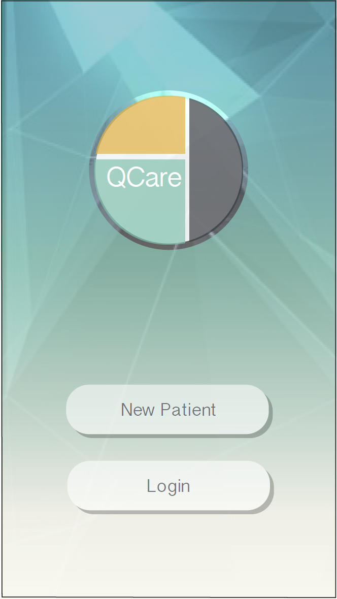
QCare

An Efficient and Intuitive Diagnostic Tool for Urgent Care

 
qcare-banner.png


Team

Bonnie Jiang | UIUX Design

Euhea Cho | UIUX Design

Madeleine Fougere | UX Research

Charles Watson | Marketing Asistant


Software

Adobe Illustrator, Photoshop and XD

Duration

Sep 2018 - Dec 2018

My Roles

UX research, Screen Design


qcare-process-01.png


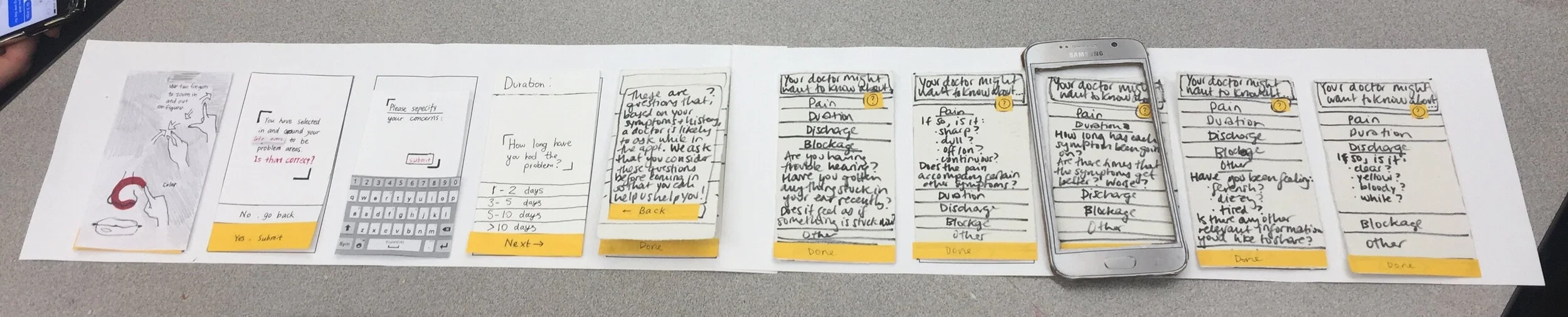
01 Overview - What is QCare?

Background

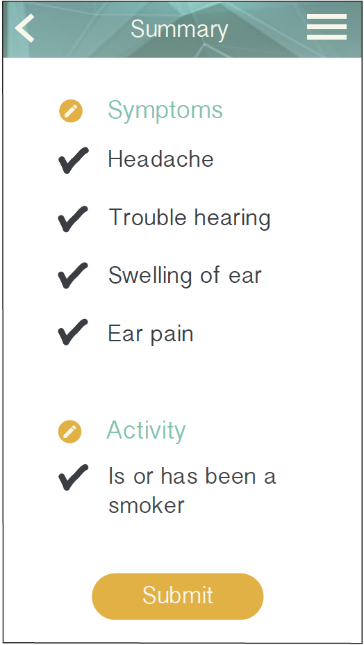
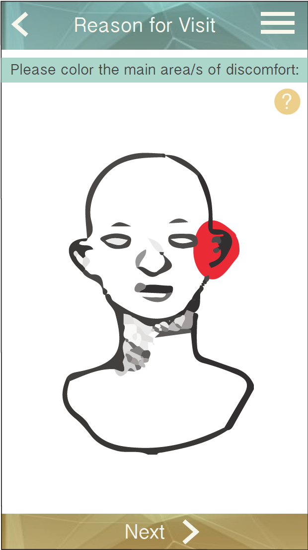
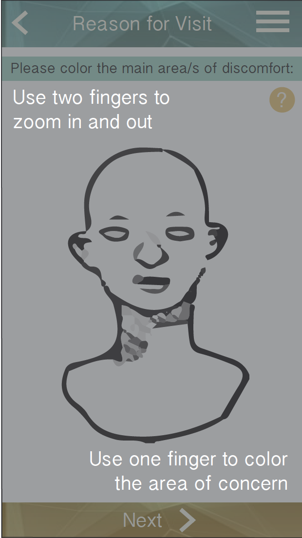
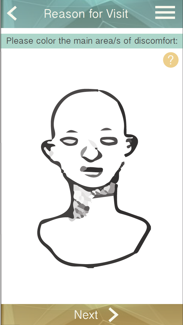
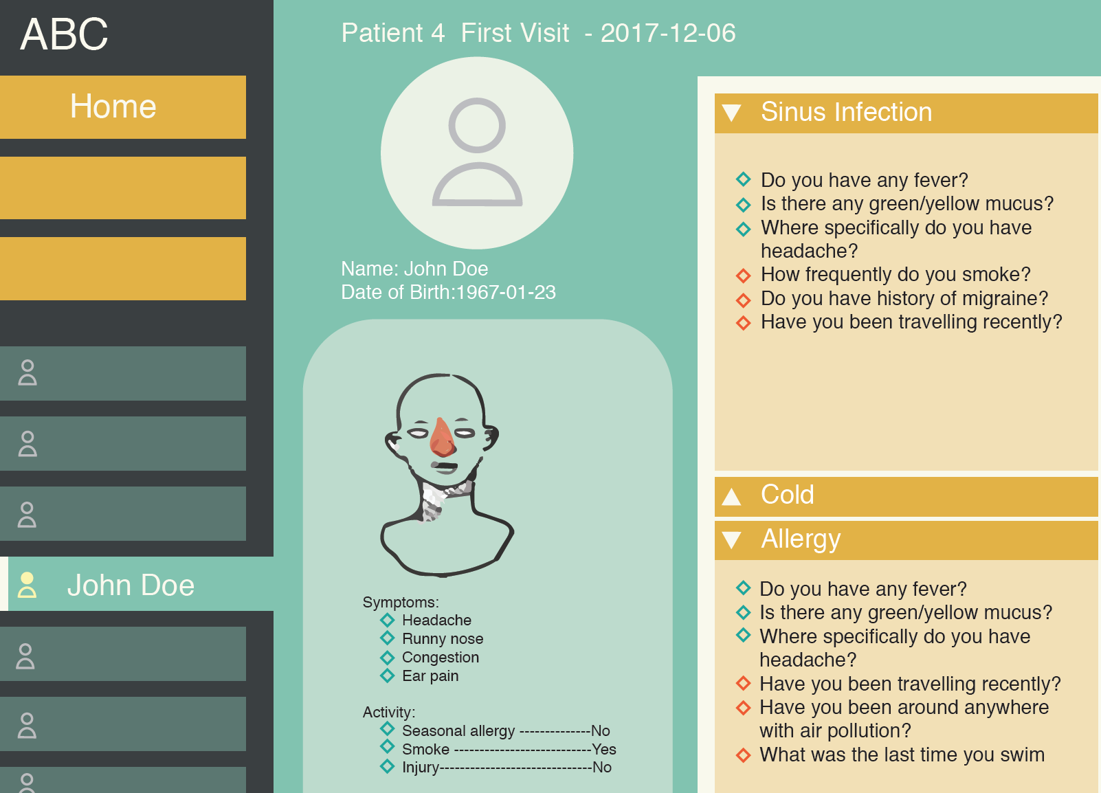
QCare is an application to assist less experienced physicians and practitioners to reduce misdiagnoses at Urgent Care. The project addressed the solution from the communication aspect between doctors and patients.

This project was done in in professor Sunyoung Park's interaction design course under the request from Doctor Eugene Rontal, an ENT specialist who notices and aims to solve the misdiagnoses in Urgent Cares related to ear, nose and throat (ENT) problems.

Context

  • Inexperienced Urgent Care practitioners often overlook some unidentified factors, which leads to misdiagnosis.
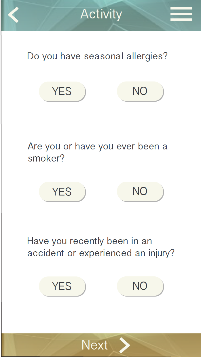
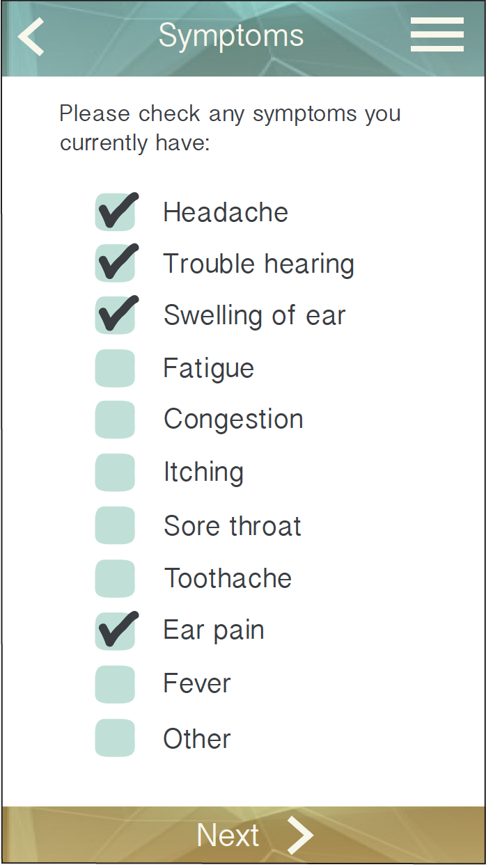
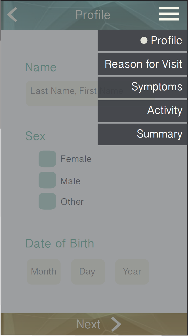
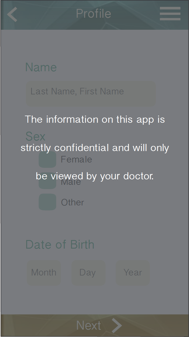
  • Patient has to fill a great amount of paperwork upon seeing the doctor.
  • Antibiotics are prescribed unnecessarily.

Market

Medical and insurance Industry

Stakeholders

  • Patients
  • Urgent Care Practitioners
  • ENT Specialists


“How might we reduce misdiagnosis between Ear-Nose-Throat problems and the common cold among practitioners?


02 Understand - What is the Problem?

Research and Synthesis

Literature Review

Our literature reviews helped us to understand the context of our design challenge and design more targeted interview questions.

  • Audience: Less experienced doctors and practitioners
  • Environment: Urgent Care.
  • Diagnosis / Communication: Misdiagnosed between ENT problems and common cold.

Due to the privacy of the Urgent Care facilities, we are only able to conduct our interviews with primary care doctors and obtain resources from ENT specialists.

Interview Quotes

Doctor A

“Working in the moment without any previous information about the patient can make the diagnosis process longer, or cause misdiagnosis.”

Doctor B

“People go to urgent care for fast service compared to booking an appointment with a family doctor, but wait times are still long.”

Doctor C

“Doesn’t like to look at large pieces of text or references when with patients.”


Affinity Diagram & Flow Model

We marked the sticky notes that described problems and pain points with red dots in order to synthesize our findings. After we categorize the finding, we created a flow model to visualize the complicated relationship

qcare-affinity.jpg
qcare-affinity2.png

Every lightening bolt represents a break point we identified during a patient visit.

flowmodel.png
 

Findings

  • The patient visit the Urgent Care, and fill in their social history, which is often tedious and ignored by practitioners.
  • The patient with ENT problem such as sinus infection has similar symptoms as common cold.
  • The patient does not understand the treatment and often requires antibiotics instead of believing in simple but effective treatment.


03 Diverge & Decide

Iterations & Testing

First Iteration

  • Improve communication between patients and doctors.
  • Reduce text and increase interaction.
  • Educate patients about ENT knowledge.

First User Testing

We added some educational facts in the interactions. We hope by providing that information, the patients will understand doctors' decisions more, and decrease the demand for unnecessary antibiotics. However, from the first user testing, educational knowledge is not efficient when patients are waiting in discomfort.

sceen1.png
screen2.png
 
 
Usertesting.jpg


Second Iterations

The users pointed out while interacting with the application is useful, it feels like there is a lack of the clinician's role in the diagnosis. Also, the users feel the questions about family, medical and social history are long and tedious.


screen2.png


Second User Testing

usertesting2.png

We further developed our sketches for user testing using paper prototypes in order to create as authentic as possible of an application experience while avoiding graphic elements that might distract from the main points.


New Storyboard

We created a new storyboard with a persona named Matt, and illustrate his experience using our product. Matt saves a lot of time waiting and are able to communicate with the doctors more efficiently. The team identified a pivoting point after revisited the data we collected through user interviews. We discovered that practitioners often overlook social history. Those factors are crucial to diagnosis, because different illness sometimes have similar symptoms. Asking questions about patients’ travel or activity history can assure the doctors before physical exams.

storyboard2.png


04 Validate - Final Deliverables

Final Concept

An application that allows patients to record ENT specific symptoms and history, which can then be relayed to doctor’s, so that they can make a more accurate and quick diagnosis of the patient illness, through suggestions in their side of the app.

I proposed to implement a desktop portal for the doctors as well, which is easier and more professional for doctors to navigate. We use ENT specialist’s algorithm to give suggestions based on patient inputs.

Phone Screen Design

interaction-design-video-sketch-2-.gif
 

Computer Screen Design

laptop1.png
laptop2.png
Screen Shot 2017-12-14 at 10.00.52 AM.png
laptop1.png
 

Video Sketch

For a more interactive and complete prototype, please check out the video for a hi-fi demo.

Qcare Mac Mockup.jpg
qcare phone.jpg