Shared Pantry

An Accessible Community to Exchange Produce during the Pandemic

 
banner-sp.jpg


Team

Bonnie Jiang

Chulei Chen

Lizbeth Guerrero,

Shirley Wang

Kylie Williams


Software

Miro, Adobe Illustrator, Figma, Premiere

Duration

Sep 2020 - Dec 2020

My Roles

UX Research & Design on "Post"


sp-process-01.png


01 Overview - What is Shared Pantry?

Background

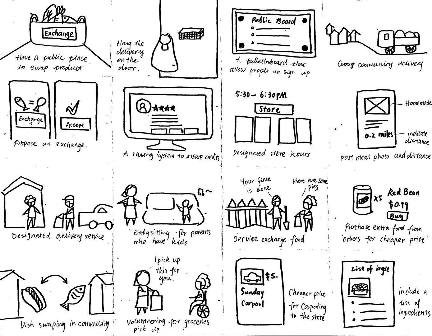
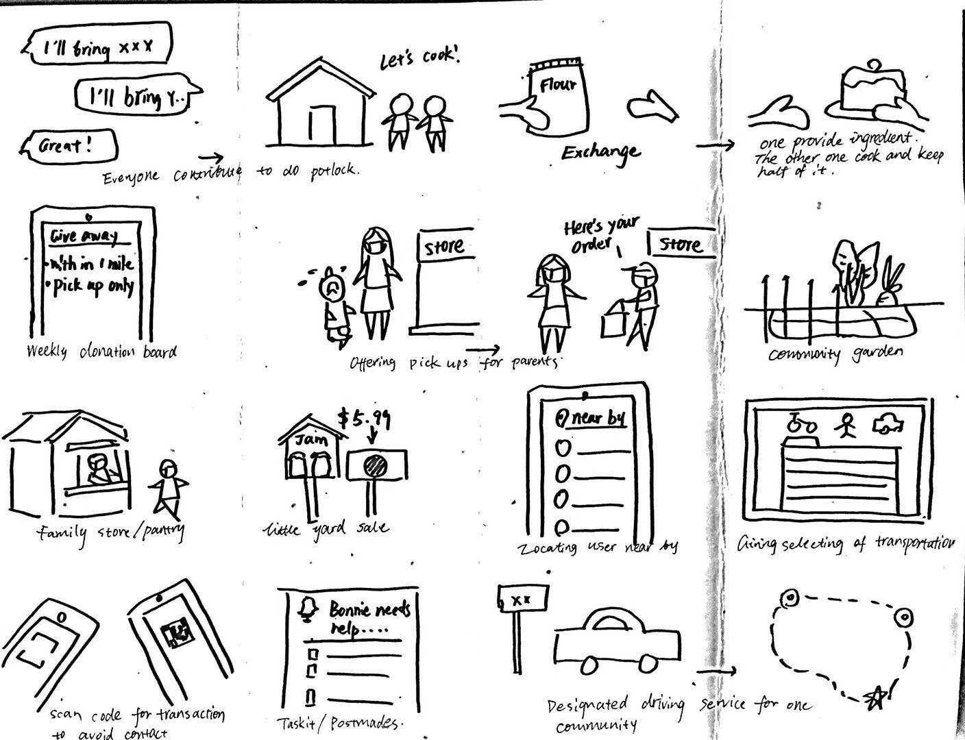
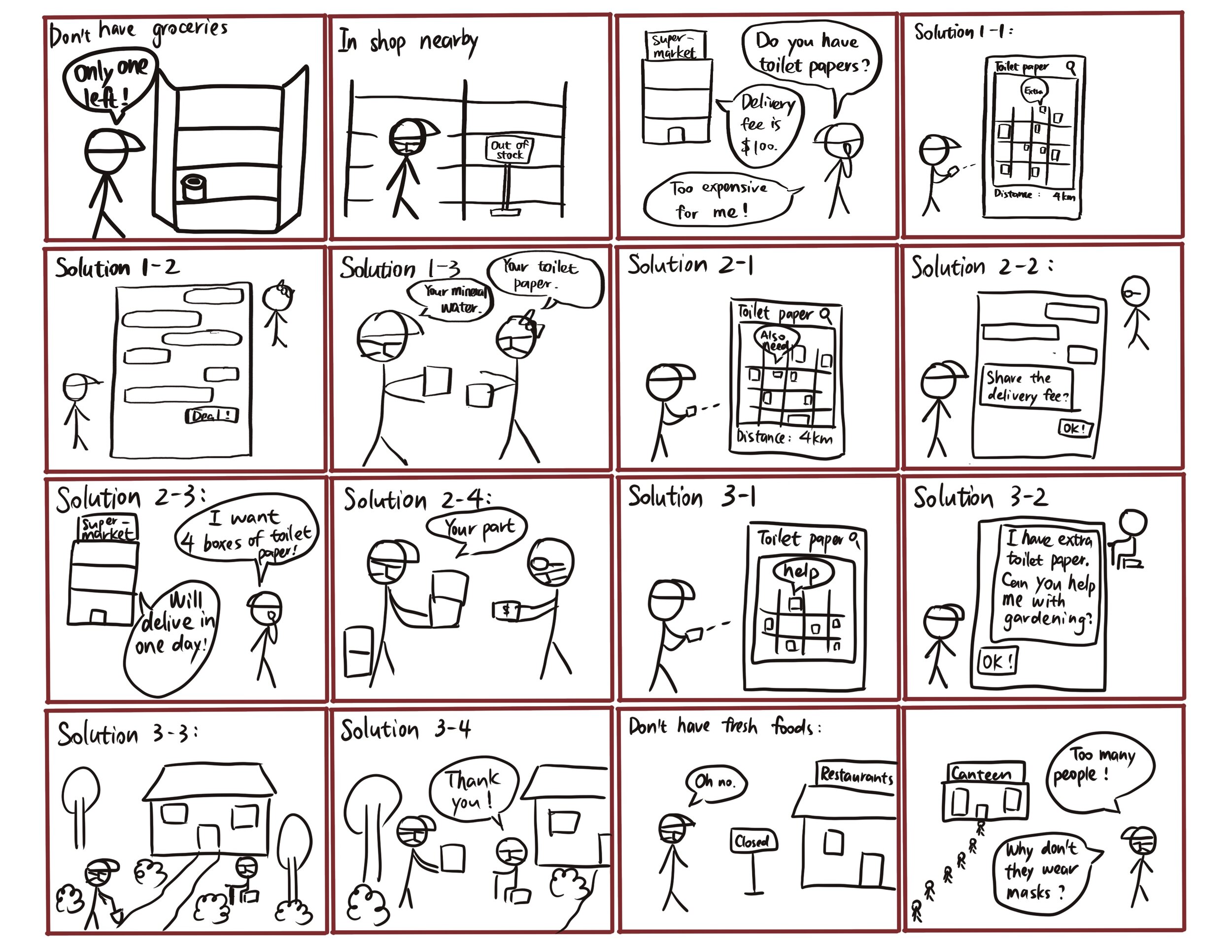
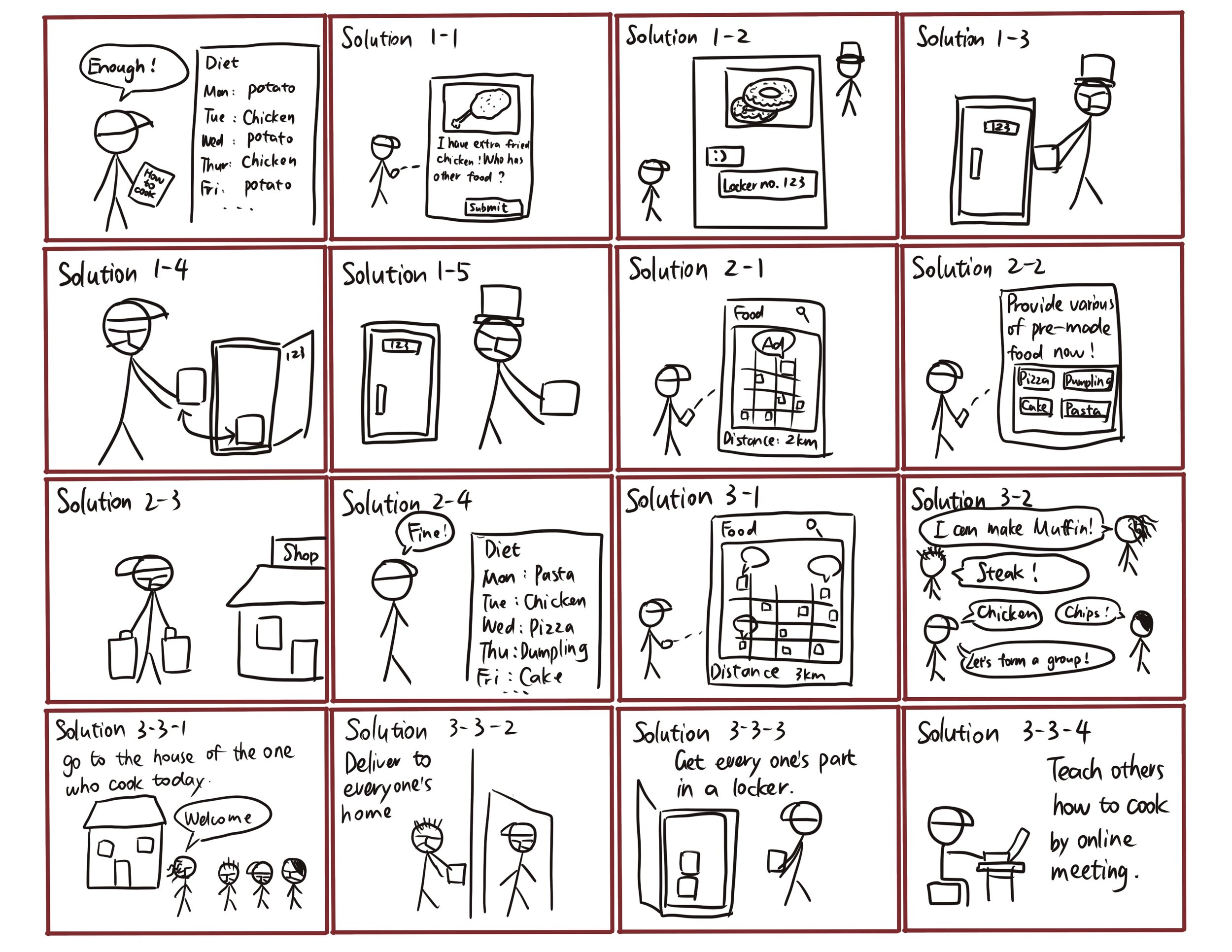
Lack of transportation and fear of Covid-19 exposure can make the typical grocery interaction less accessible during the pandemic. On the one hand, individuals often need to buy excessive produce to get it delivered, ending up consuming the bulk of their orders for days. On the other hand, some families struggle to get certain essential products, as shopping is not as easy as before. There is no coherent and official solution to share the pantry and build a trusted network. We wanted to create a method for strangers to exchange household items or foods through a platform they could trust.

Target Users

  • People who lack transportation

  • Have a fear of shopping during Covid-19

  • Have financial stresses

What they are looking for

  • Safe, reliable, and cost-effective means of obtaining foods and services

  • Feeling of community within their neighborhood

  • Options nearby, ex. walking distance

  • Non-contact option to acquire necessities


“How might we provide an accessible way for neighbors to share the pantry and build a trustworthy network between the community during this vulnerable time?


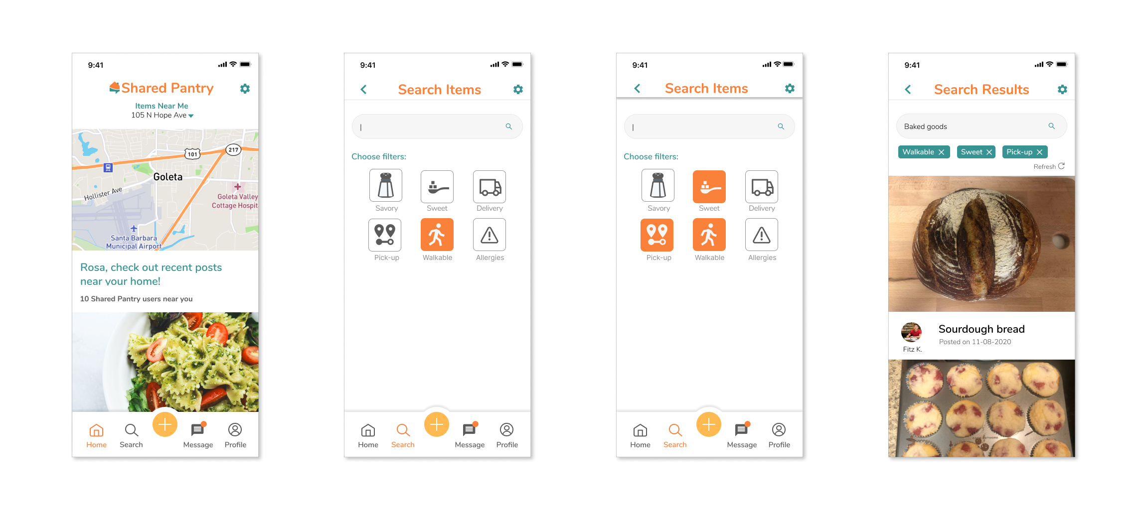
01 Search Nearby Items

When users search for the items, they can choose the given filters to meet different needs and get more highly matched posts. The result can include extra produce or homemade food. To search for specific items, they only need to type in the keywords in the search page to see relevant posts. They can click on the post to get more details, interact with others in the community, and contact the person who posted this item.

 
home2.gif
post.gif
 

02 Make & Manage Posts

Users can also make posts to exchange using the orange plus icon. In each post, the user can input the quantity, select the exchange method, exchange type, allergens, and mask requirements. The information is to provide safety percussion during the pandemic through social distancing.

03 Exchange & Message

Unlike other food applications, our design does not include any money transaction. Users can make exchanges with nearby communities using the message function. We want to encourage users to communicate with each other through the app to make the connection between each other. By allowing them to exchange, we hope to build a support system instead of for profit.

 
exchange.gif
givethank.gif
 

04 Give Thanks & Review

Shared Pantry built a platform for users to express their gratitude. Users can send customized thank you note and give reviews to spread positivity during this hard time and also ensure that the exchanges were made safely.


02 Understand - How to Better Support this Activity?

User Interviews

Relating to our personal experience during the pandemic and secondary research, we created an interview protocol asking users’ challenges and experience shopping during Covid-19. We conducted 12 user interviews. The demographics included the elderly, the financially constrained, young parents, college students, and working adults who lived alone. We selected the interviewees to ensure the variety, specifically on potential marginalized users who do not have access to much transportation.

 
interview.jpg
 

💡Identify Key Functions Our Solution Supports

We identified five key functions our solution needs to address:

  • Limiting food waste among the community

  • Easing access to bulk orders

  • Sharing and connecting with neighbors

  • Exchanging products

  • Offering a variety of products and homemade dishes. 


Competitive Analysis

01. 🔍Identify Competitors’ Products with the Function

Based on the challenges learned from interviews, we identified competitors who are currently addressing their needs and divided the competitors into the following categories:

competitors2.png
Competitors Types of Competitors Pros Cons
WeChat Analogous Competitor
  • Free of charge
  • People can get information in various ways easily
  • No safety assurance
  • Lack of confirmation function for the payment
Nextdoor Parallel Competitor
  • Aids local communication
  • Easy to learn nearby events and read local news updates
  • Lack of prevention on negative content
Freshly Partial Competitor
  • Accessible and intuitive navigation
  • Convenient for people who lack transportation
  • Not affordable for the underserved communities
Instacart Partial Competitor
  • Large selection of stores and products
  • Can track shoppers in real-time and make alterations
  • Having any guarantees on product availability
  • Not affordable for the underserved communities
Hungry Harvest Analogous Competitor
  • Reduce food waste
  • Support local business
  • Limited geographical region
  • Lack of produce options

02. 💡Reflection/Lessons Learned

In conducting our analysis, we raised a few questions regarding our audience and inclusivity as well as our desired functions and maintenance strategies for the app. We were aware of the challenges associated with selling bulk items and homemade food and would need to give this further consideration. We also need to think about if our existing solutions are truly inclusive. Out of our large list of desired functions, which ones are our priority? Finally, in terms of maintaining trust and quality within the system, we need to further discuss ideas of creating an inclusive and welcoming community.


Persona

Based on the interviewees, we created 4 personas. The number was to ensure we cover the diversity of the user groups to create a community instead of a specific target group. After we gain enough understanding of these personas’ needs and wants, we set Rosa, the single mom as our primary persona. We selected this persona because she shared the most challenges with other groups.

Team2 Persona_Page_3.jpg
Team2 Persona_Page_1.jpg
Team2 Persona_Page_4.jpg
Team2 Persona_Page_2.jpg

Storyboard

Each member did rapid storyboarding to explore various solutions. Then we discussed and selected frames from the storyboards to construct a scenario. I also did an additional storyboard to picture a scenario.

A storyboard I created for the persona “Fitz”

A storyboard I created for the persona “Fitz”


User Flows

The team went through 3 iterations of user flows. The final version of user flows included decisions and interactions the users need to go through on the product. The user flow provides a comprehensive walkthrough of users’ experience.

 
Shared Pantry App (2).jpg


03 Diverge

Paper Prototype

First Iteration

We each prototyped in paper and tested separately. I prototyped for the search, make a post, and edit posts functions.

First User Testing

Although most of the collaboration happened in distance due to the pandemic, we made sure the testing was done in person. I made the following two changes based on the user feedback:

  1. Adding more microbreaks on the post-experience to make the process more seamless.

  2. Following the mobile design standard on the pop-over menus.

paperprototype.gif


Wireframes

Improvement/Changes We Made:

  1. We agreed on the user profile in the wireframes. In paper prototypes, some of us chose different user-profiles and caused some inconsistency and confusion. 

  2. When prototyping, we agreed it would be more efficient and clear to follow a top-down process instead of the bottom-up approach we took. It would make the interaction more seamless and less clustered if we prototype the main interactions such as navigation first. 

wireframes.png

Style Exploration

As a group, we first met together to finalize the style guide and font choices. We started by each choosing two sets of color palettes and two typefaces. Then we each cast two votes to finalize the color palettes and typeface to move forward with our digital prototype v1.

style-explore.png
style.PNG

Digital Prototype V1 & V2

We each took on 1-2 main functions and prototyped in Figma.

digital prototype.PNG

Second User Testing

As a team, we developed ten tasks and had each of our users complete three to four tasks. With this approach, we were able to test each function two to three times. Following our individual testing sessions, we met as a group to divide the defects into their respective screens and discuss our options for improvement for the next version of our digital prototype. There are two red flags we inspected.

🚩Styles & Consistency

The style of text on the home screen influences how efficient users can access the information. The popover text size and icon are inconsistent with the ios design.

🚩 Navigation

It is less intuitive to embed the add post icon with “my posts” since the user posts frequently.


04 Converge

Design Improvements

🛠️01-Navigation Bar

At first, we had “exchange history” and “make a post” all under “my posts”, which can be confusing to the users. Users also had to go through a subpage to make a post, making the process not feel intuitive. In the final design, we moved the history into “my profile”, and allow users to make a post from the main navigation bar. The process becomes more efficient.

change1.png

🛠️02-Exchange Method

In a previous design, users needed to type long descriptions of the products, and there was inconsistency between search filters, exchange filters, and post. In the final design, we added more “microbreaks” in the exchange methods to allow for more cognitive ergonomic. Finally, we adopted the same icons and filters in the screens to establish consistency of visual communication. 

change2.jpg

🛠️03-Industry Standard Style Guide

As a team, finalize the style guide and the ruler guide. Decide on font size based on industry standards.


styleguide.png

Final Deliverables


01 Create and Edit a Post

Users can also make posts to exchange using the orange plus icon. In each post, the user can input the quantity, select the exchange method, exchange type, allergens, and mask requirements. The information is to provide safety percussion during the pandemic through social distancing.

Frame 19.png
 
Frame 20.png

02 Give Thanks & Review

Shared Pantry built a platform for users to express their gratitude. Users can send customized thank you note and give reviews to spread positivity during this hard time and also ensure that the exchanges were made safely.


03 Make an Exchange

The user can use the chat function to confirm exchange information. By clicking on the plus icon behind the emoji icon, the user will be given four buttons to choose or take a photo to send, to send the user’s location, to send exchange location, and to send exchange time.

Frame 21.png
 
Frame 22.png

04 Search Items

When users search for the items, they can choose the given filters to meet different needs and get more highly matched posts. The result can include extra produce or homemade food. To search for specific items, they only need to type in the keywords in the search page to see relevant posts. They can click on the post to get more details, interact with others in the community, and contact the person who posted this item.


05 Validate

What We Did Well

  • Shared Pantry could encourage communication and help individuals who feel isolated, especially during Covid-19.

  • We were able to design and implement features addressing the safety concerns during the pandemic, such as masks, exchange method filters, and non-contact exchange methods. Shared Pantry offers an alternative means of acquiring essential items and could alleviate fears and reservations present in the grocery shopping experience.

  • As a team, we collaborated virtually through 3 time-zones. We established cohesiveness and thoughtful design decisions through rigorous testing and iterations.

What to Improve

  • Given that our app requires interacting with strangers, there is a level of risk each user poses at the point of exchange. Additionally, there is a risk for users to steer away from conversing about exchanges without platform moderators.

  • Users are largely on their own in confirming that a seller has positive reviews and in trusting that their food is edible and following food safety standards. Without proper verification that food safety standards are followed, there is a chance for potential food poisoning to occur. 

What I Learned

In the beginning, it was more concerning to me about how to maintain consistency in the visual designs. Before this project, I have only collaborated with one or two designers. It was different in a multidisciplined team than a team with five designers. I learned to give constructive feedback and also back up my design decisions with testing results. I learned to embrace different visual tastes and establish consistent styles by setting up a detailed style guide. I would not have been achieving this quantity of interactions if we work separately.