Maintenance

Interactive kiosk for reporting facility maintenance

banner.jpg
 

Project Overview

Software

Adobe Illustrator, Photoshop, Autodesk Sketchbook and Figma

Duration

7 Days

My Roles

UX research, Screen Design

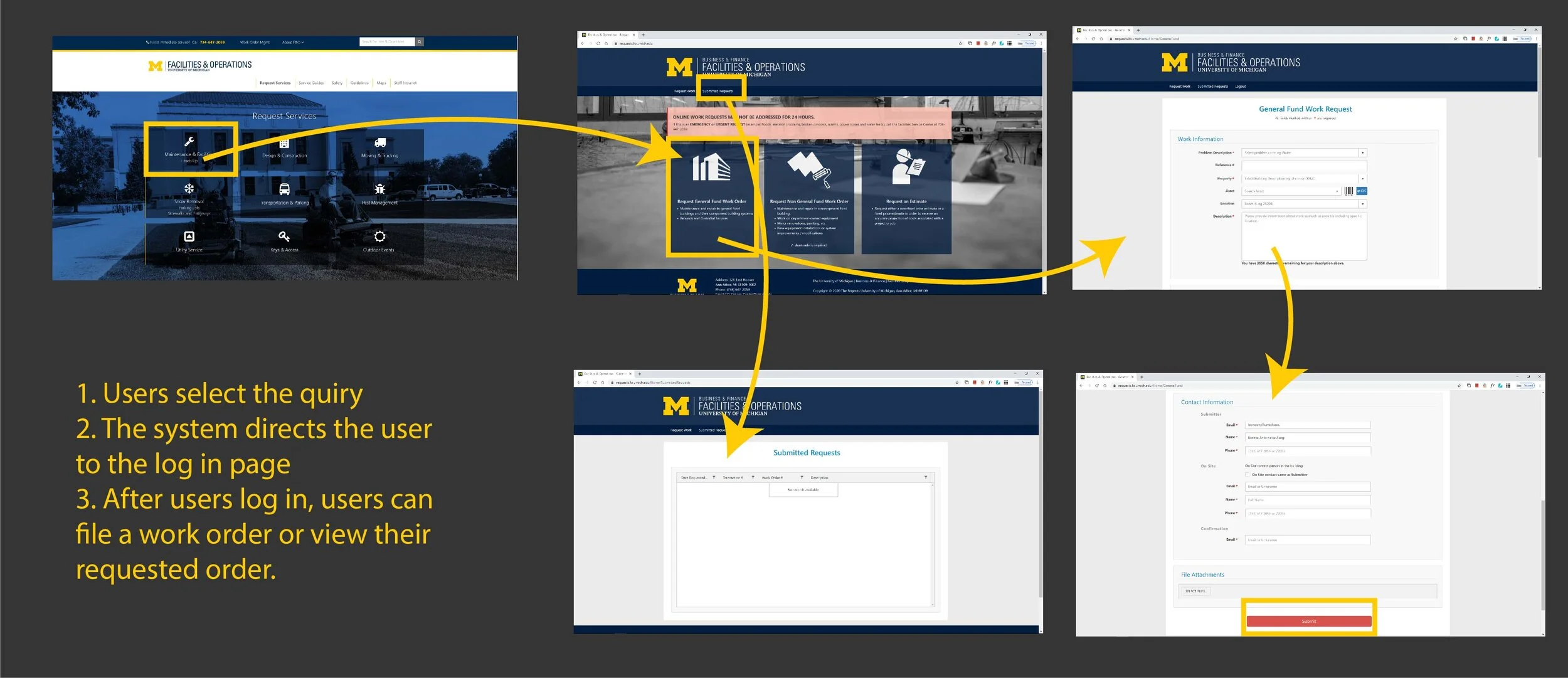
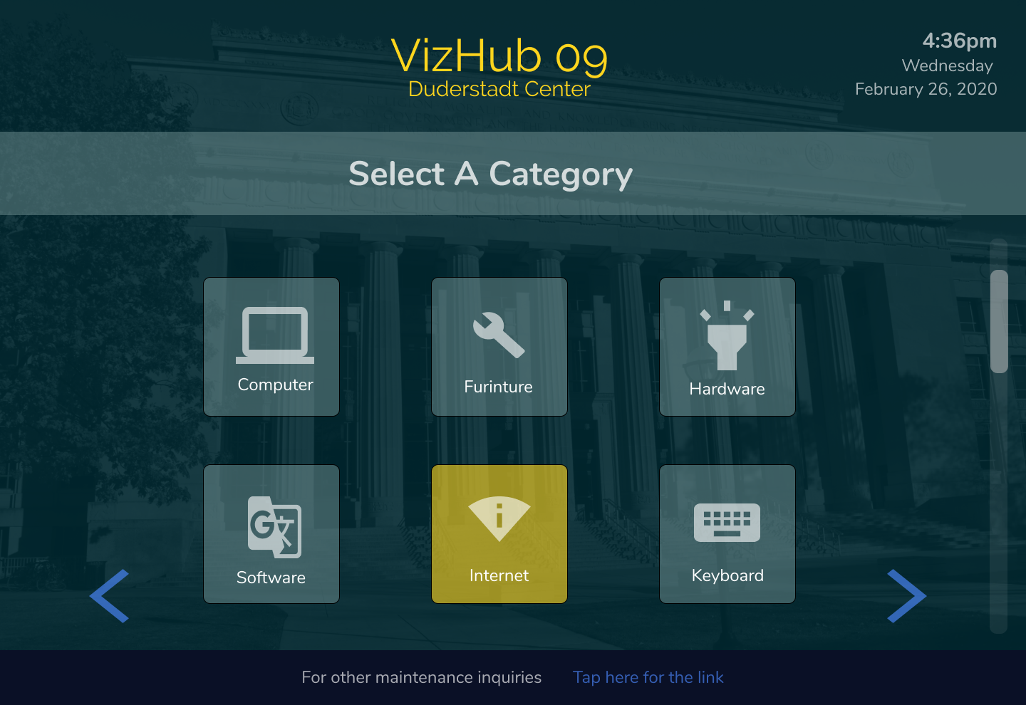
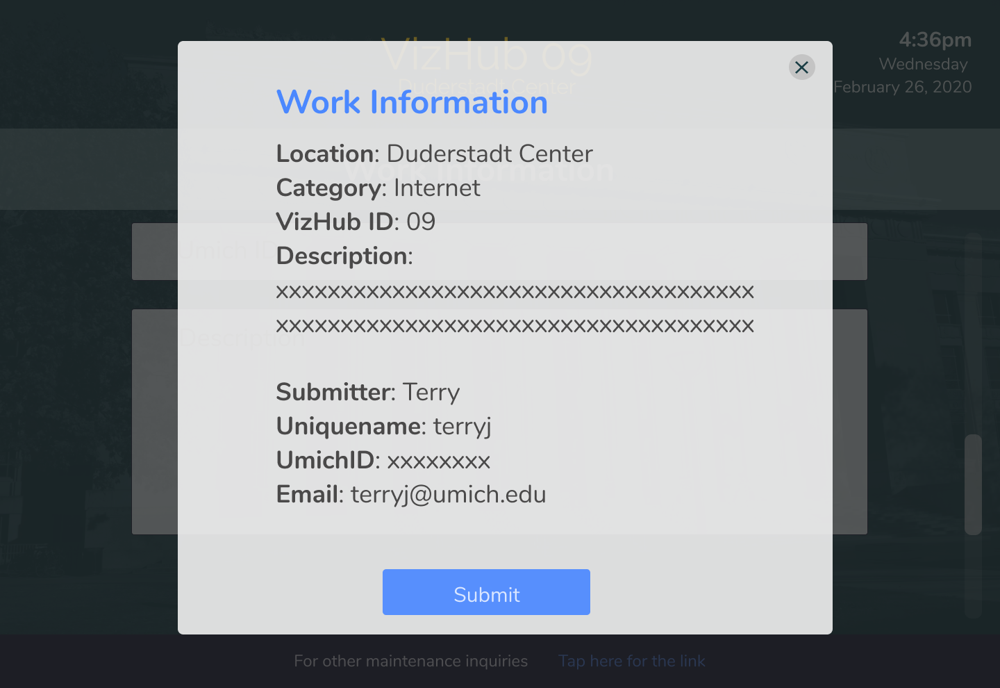
This project is a part of the Google 2020 Design Exercise for the user experience design internship. I dive deep to explore the problem of the University of Michigan’s maintenance and repair system and presented a different approach in an interactive system as a designer.

I took this exercise to be an opportunity to to improve the upkeep of campus facilities by creating a new system for reporting any facilities that may need maintenance or repair. I will showcase my design process from conception to hi-fidelity explaining my research, reasoning, and other inspirations for this challenge

"How might I design an experience that allows students to report building or equipment issues on campus with less time and more accessibility?”


Research and Synthesis

Initial Exploration and Reflection

Before diving into my research and design, I planned out the process and steps I should take to better tackle this problem.

Keywords: Accessible, Inclusive

google1.jpg

Problem Identificication

Problem Identification - Stakeholder Map

I first started with mapping the stakeholders in the maintenance and repair process. This process helps me as a designer to think more comprehensively on the potential audiences, that way I can design more inclusively. The stakeholders are identified below:

Stakeholder+Map.jpg

Problem Identification - Secondary Research

I then performed analysis pulling from campus maintenance reports and explored current systems available for students on campus to file maintenance orders. In the general guideline of the campus facility, one problem identified is that the repair rate of the Duderstadt Center (Engineering library) is low, while the complaints of broken work stations (VizHub) are high.

Keyword: Unrepaired Workstations


Interaction Map

To explore that problem, I made an interaction map understanding the current system at the university on reporting repairs. I found out surprisingly, the school site is clear and intuitive. Students can easily access the website and file a claim.

If the current system is working so well, what is causing the low reports on the campus maintenance order?

 
websiteinteraction.jpg

Problem Definition

Problem Definition - User Interviews

I conducted user interviews with 3 users, one student, one office worker in the library and one technician who is in charge of library repairs. Some quotes are listed below:

Interviewee 1

"If I see something is not working, I will just switch stations until I find a working one. I am aware of our maintenance site. I just did not bother to report."

Interviewee 2

"Students have a totally different portal than us. We have a more complicated system for internal use. And it would be much easier for students to file orders on their own."

Interviewee 3

"I will occasionally get a complaint like nothing is working in our library. If you all file a request when you see something broken, the repair would be much up to date."

"I will I can close a working order without returning to my desk."

Problem Definition - Affinity Map

I clustered the data I collected during interviews to find similarity and common pain points.

Keyword: Lack of Motivation, Time Inefficiency

Inked428936310_LI.jpg

Survey Results

Problem Definition - Survey Results

I distributed 30 surveys at the Engineering Library (without revealing Google's name in the survey) and received 24 complete answers. In the survey, I asked students to rate their satisfaction level on maintenance quality and their awareness and frequency on filing maintenance requests using the school website.

I also additional questions on their access to technologies when they encountered a broken item. This process helps me validate my user interview findings and secondary research results.

surveydata.jpg

Research Summary

Findings

  • The current website of maintenance repair is actually concise and intuitive, but not many students are aware of it.
  • Students tend to switch places instead of filing repair because they think it is staffs' responsibility. It is also faster to switch stations than filing report because getting broken station fixed does not address their immediate needs.
  • Technicians need to return to their workstations to close a working order, which wastes time.

Goals

Reporting Side:

To design a ticket system that allows students to report maintenance issues right away that is also accessible in the current location without requiring to go on an additional website.

Technician Side:

To design an app that allows them to get updated information on a maintenance order or to close an order without returning to their workstations.


Personas and Scenario

Wait... No personas this time???

Due to time constraints, I combined my persona development with the scenario. Rather than creating basic user profiles that have risks of stigmatizing myself, I prefer walking through a design problem with an actual story. I described a student, Terry's frustration when working with Vizhub (the working station) of the university library.

scenario2.jpg


Iteration & Testing

First Iteration

For the reporting side, I decided to make interfaces for a kiosk machine, where students can file the maintenance order of a station onsite. I thought of this way because I keep thinking about the mission of Google is to design products that are accessible and inclusive to everyday walk. Filing a repair request on a kiosk, students can respond to a broken station immediately. If they do not have their laptop/phone with them (chances are high, since they are working at a VizHub), they can still contribute to the community.

As a product designer, my initial intuition is to sketch out several kiosks design. However, I decided to bring the experience into context. I discovered that the school has implemented an android tablet at each station as a sign-in kiosk. Therefore, I decided to implement my screen design into an existing Google product that is already in use in the system. Also, the current design is more accessible for students in wheelchairs, since it requires no standing.

kioskdesign.jpg

Development

User Flow

Initial Sketch

Once I understood the problem I was solving, I started out sketching some screens under the main functions I wanted to achieve.

I also sketched out the phone screens for the technician. My main focus on this portal is to help them manage the status of the working orders. Therefore, I prioritized more energy on this function instead of every aspect of the process.

phonewireframe.jpg

Wireframes

After some iterations I continued the development using Figma to create wireframes.

 
wireframe1.jpg
chrome-capture (10).jpg

New Scenario

I created a new story picturing when my solution is implemented.

new scenario4.jpg


Final Deliverables

My final design includes a kiosk portal for students to submit work orders and an app for technicians to organized and updates the work orders. The design adapts the school’s current kiosks at each workstation.

Kiosk Screen Design

chrome-capture+%2811%29.jpg
 
Surface Pro 3 - 1.png

The students can choose to check-in at their workstation or to submit the work order. They will be asked to log in using their school id and password so that the system has a record of who submit the maintenance request. At the bottom of the screen, the student can also access a link and a QR code of the campus facility site, where they have more access to other maintenance quires. The QR code also spread the awareness of the school site, which according to my research isn’t used very often.

Surface Pro 3 - 2.png
Surface Pro 3 - 3.png

The students can select the location and categories of their request. I use icons to represent the categories because I want to have the typing to be minimum. Once the students select a category, the color will change accordingly to reflect their choices. They can also navigate to the previous page by tapping the arrow button on the bottom of the screen.

Surface Pro 3 - 4.png
Surface Pro 3 - 5.png
Surface Pro 3 - 6.png
Surface Pro 3 - 7.png

The student will be requested to enter their description of the problem, so the technician has more details. Once they finish, they will review a synopsis of their request. Once they submit the order, a work order number will generate, and an email confirmation will send to their school inbox.

Surface Pro 3 - 8.png
Surface Pro 3 - 9.png
Surface Pro 3 - 10.png
Surface Pro 3 - 11.png

Phone Screen Design

The technician will be able to manage the order on their phone. It is more portable and easier to update than on the website, which will increase their efficiency.

Technicians can sort the work orders by their priority, date, location and other criteria. They will see the list of orders and a simple overview of the request. The requests are labeled with different colors indicating their priority.

The technicians can also read more details about the request by tapping into the synopsis. On this page, they can also change and update the status of the order.

 
Capture.jpg
chrome-capture+%2815%29.jpg
 

I also considered the situation of collaboration. Since technicians collaborate in teams. I designed a people page as well. They can see each other’s profile and role, and the current order they are working on. By updating each other, the technicians can divide the tasks more efficiently.

Google products

Considering Google offers a varied range of products. I want to incorporate some existing products into this system. I added a page for the Google calendar on the technician side. Users can add a maintenance request to their calendar and have a Google reminder set for them

 
chrome-capture (16).jpg
chrome-capture (19).jpg


Reflection

If I am given more time to dive deeper into this question. I would change and explore the following:

  • Incorporating more actions in the kiosk design and understand what other factors I overlooked during the design process.
  • Expanding on the screen designs of the technician side. What are some other functions and features the technician needs to make the process better?
  • What would the system react if multiple same requests are submitted? How can it inform students a similar request has been submitted?