Bon Voya

A Luxurious Getaway

bonvoya-shadow.jpg


Projects Overview

Software

Adobe InDesign and Photoshop

Duration

Nov 2019

Areas of Research

Meta Cognition, Common Ground, Three Emotional Levels

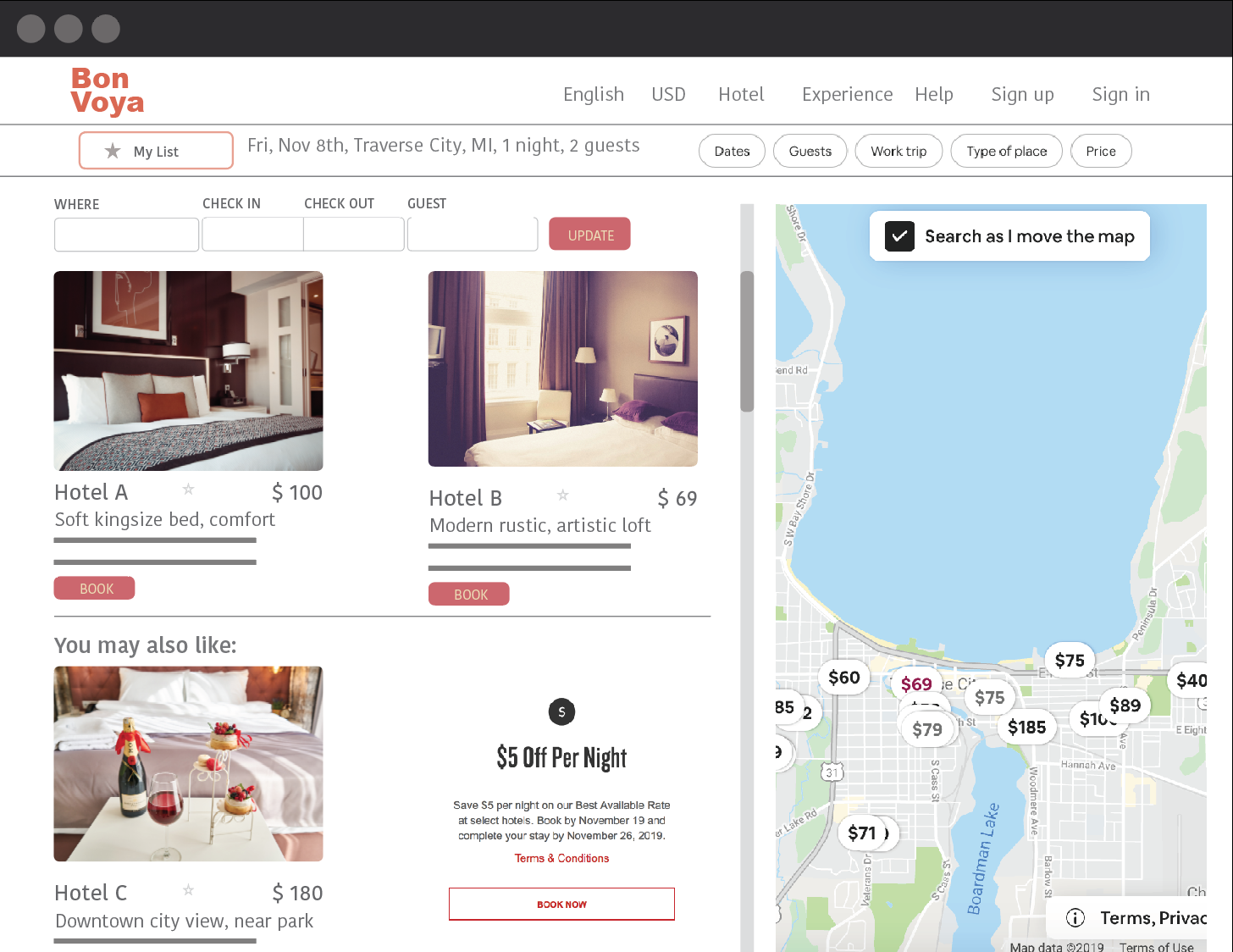
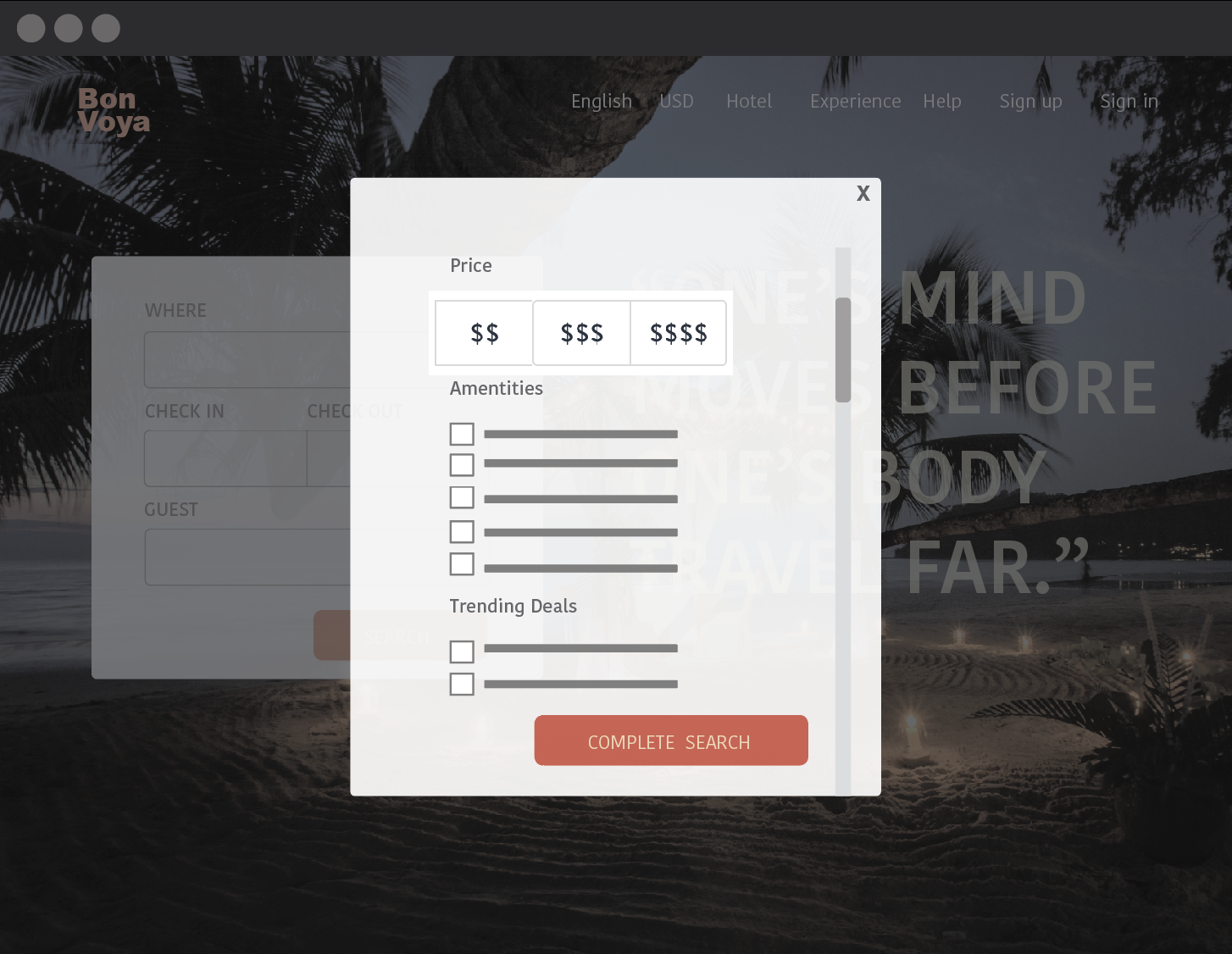
Bon Voya is a redesigned hotel reservation system on the basis of knowledge of human capabilities and behavior. It showcases how concepts of metacognition, incentive theory, and constraints on groundings affect the design of an interactive system.

Bon Voya is an end product of a human cognitive science thesis. In the thesis, I compared two interactive systems site A and B by using concepts of human capabilities and behavior. After finishing the comparison, I decided to design own hotel reservation system by applying the concepts I had learned from human cognition.


“ How can I redesign a new hotel reservation site by applying the concepts of human cognition? ”


bonvoya1.jpg
bonvoya3.png
bonvoya2.png
Screen Shot 2019-11-08 at 8.22.23 AM.png


Explain and Goals

Goal1

Explain

Bon Voya is a hotel reservation site for price-friendly hotels. The goal of my design is to allow users to reserve a vacation with great deals and customizable features, but still maintains a sense of feeling that they are planning luxurious getaways.

Goal 1: Locate trips with great deals and customizable features **

Since the goal is to allow users to maintain effortless searching, while their attention is fixated on details, the following principles are applied in my design to remind users to perform certain tasks.

Metacognition

Fig 1

Fig 1

I adapt principles to improve user’s metacognition to ensure that they are more cognitive about customizing their searches.

The pop window eases the informational retrieval for users, saving them an effort to remember searching for specific features. It also ensures this feature is well utilized.

The site also allows users to add hotels to a list. It also labels the hotel price on the map (Fig. 1). Users spend less effort in decision-making, preventing them to make default simple decisions.


Goal2

Incentive theory

The design motivates users to search deals by presenting incentives on extrinsic motivation. (Fig. 2).

These incentives are motivation for people to utilize the sites or reserve certain options.

One trade-off I made is to make the discount suggestion as subtle as possible, meaning the users are not going to see those incentives unless they browser into certain sections. The reason behind is that I want to keep the reflective of the sites away from being “cheap”.

Fig 2

Fig 2

Constraints on Grounding

Reviewability and Revisability

I applied constraints on grounding to avoid ambiguity in the media communication.

Users will be able to review on the sidebar on what kind of features they selected earlier from the pop-up window on the homepage (Fig. 3).

When users click on their list of saved hotels, they will also review the information on the date, type and location they searched earlier (Fig. 4).

Users will be able to modify their search features, date and location anytime on the side.

Fig 3

Fig 3

Fig 4

Fig 4

Maintain a luxurious feeling

I want to establish the emotion for these sites to be luxurious, relaxing and comfortable. Therefore, I try to manipulate the color, text, and shape of the site elements to establish the three emotional levels of the perceived image.

Visceral: I try to match the appeal of the site to any luxury hotel reservation portal. The images I used are a high-resolution resort scene (Fig. 5). Besides the logo and few buttons, I try to use thin weight lines, borderless section and gray sans serif font.

Behavioral: I implemented the search panel in every step of the navigation. Users can modify the search with minimal effort.

Reflective: I use text to help establish a drive to guide users to reflect on the positive side. In the home page, I use the slogan to build the positive mood (Fig.6).

Even though the sites features hotels with low price, they would not associate the product with low quality. Instead, they will feel highly self-esteemed because they are planning exciting getaways.

Fig 5

Fig 5

Fig 6

Fig 6

Fig 7

Fig 7

To disassociate the sites from “discounted product” and low quality, I made some trade-off in affordance and signifier. I keep the option of showing deals, but I use a less noticeable signifier (Fig.7).

For example, the “learn more” button next to the discount message does not have outlined. I placed an underline to indicate the clickability. The affordance still exists, but the signifier is less obvious compared to other buttons.


Final Deliverables